Store concept
Explore our innovative new store concept
As part of our mission to give our customers the optimum shopping experience, we are continuously investing in our existing portfolio of shops. We are in the process of gradually upgrading them all in line with our latest store concept (complete with air conditioning).
With our bold new signage and fresh image, KODi is attracting attention as a stylish and modern brand.
The old warm beige on the outside of the stores has been replaced with a fresh white with splashes of magenta and modern signage. KODi has positioned itself as a friendly neighbourhood store and that is clear to see from the new look even before you step inside. With a nod to the location on the front of each store, KODi is giving off a strong message that it is a (new) neighbour.
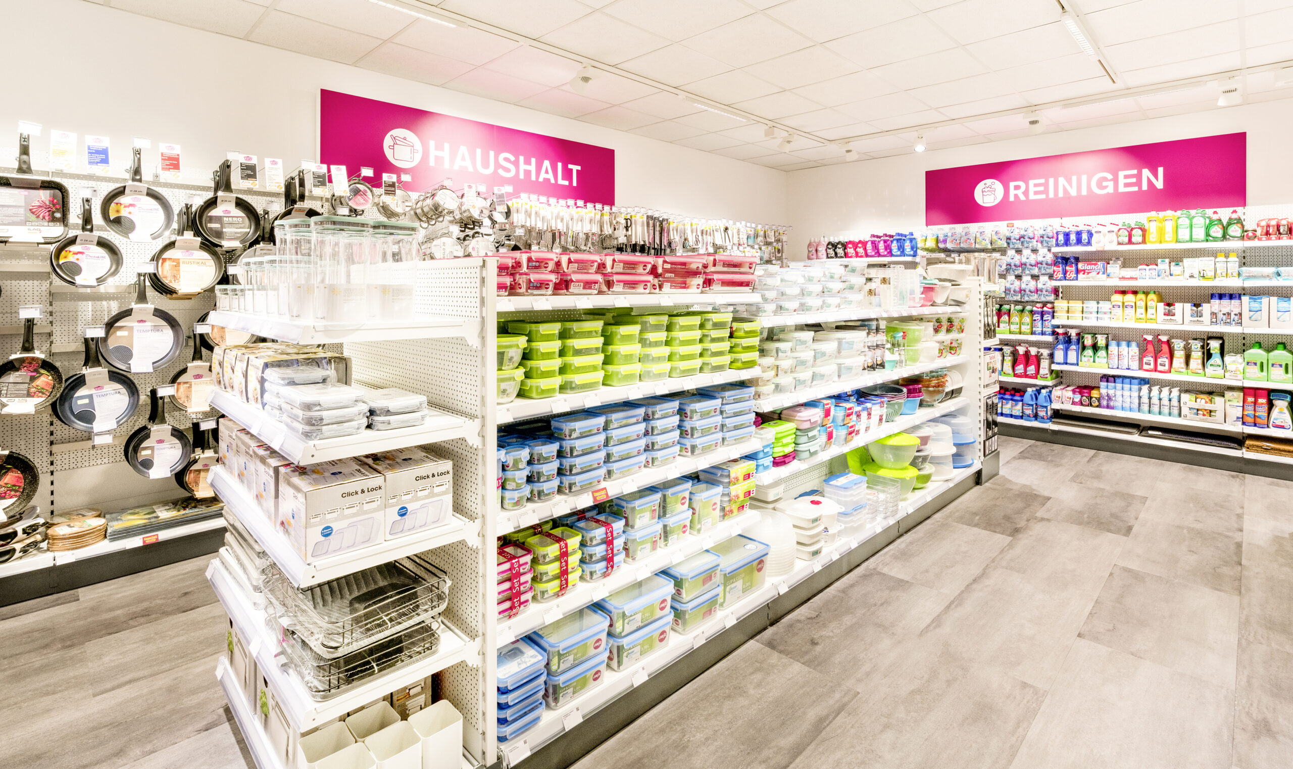
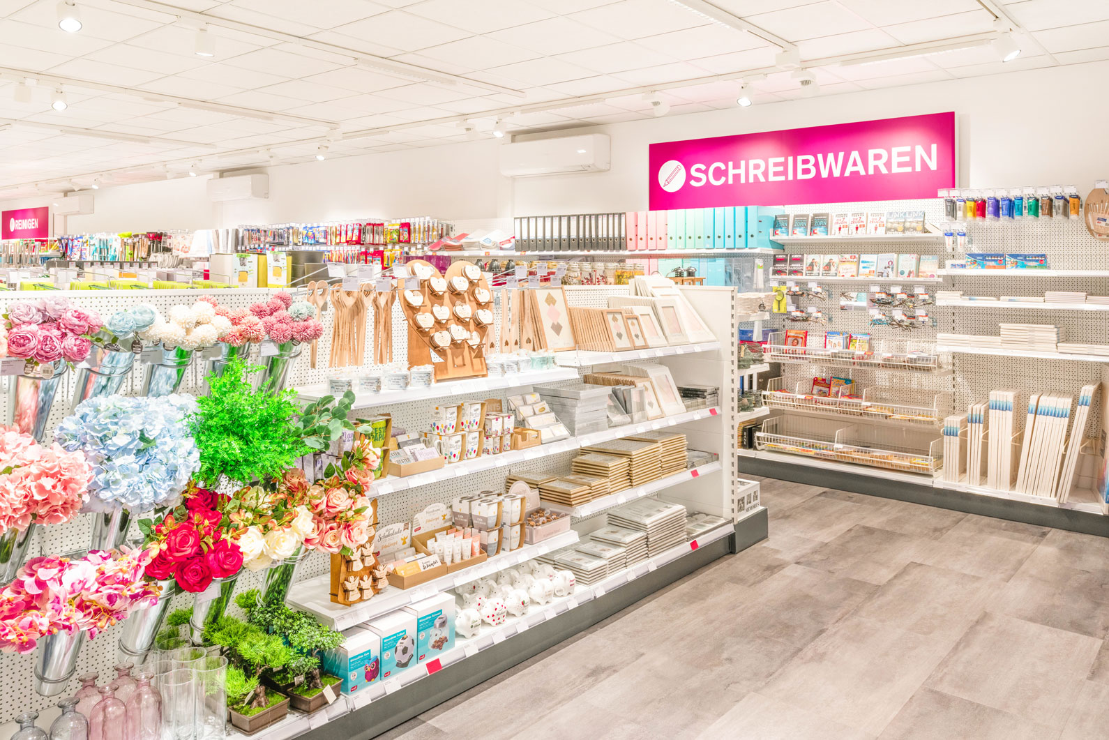
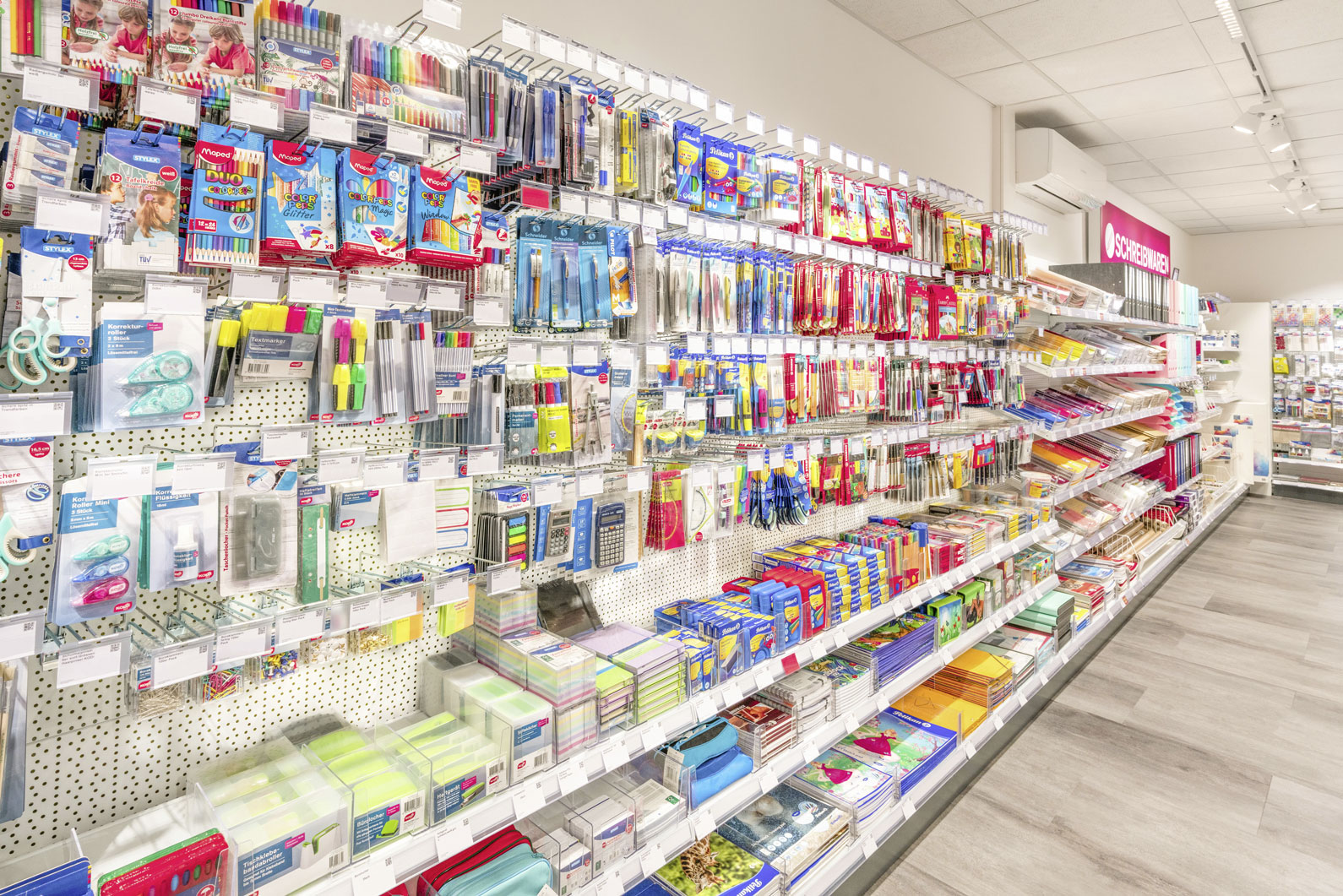
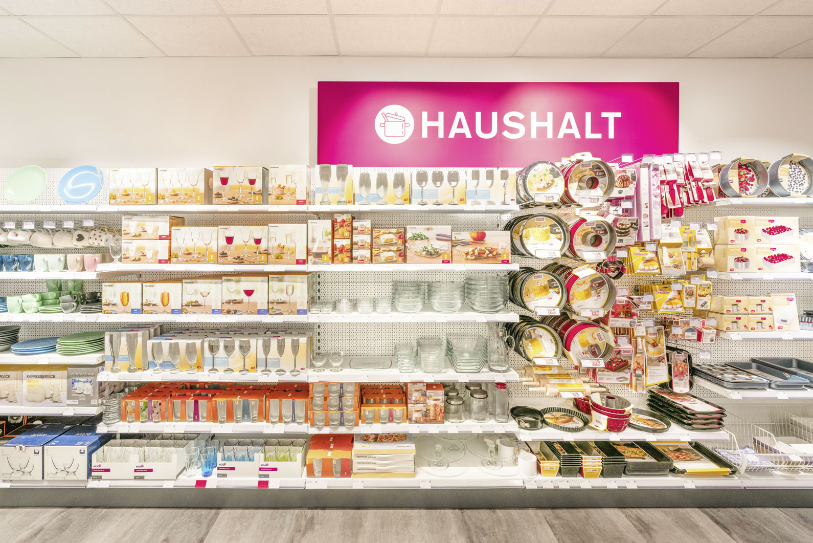
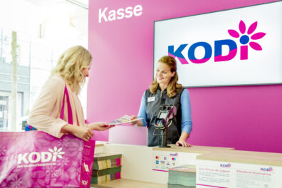
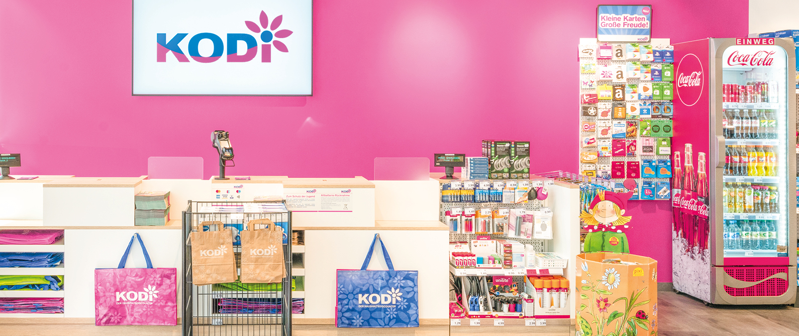
Our distinctive interior design concept moves away from what you would usually expect from a non-food discount retailer. On the inside, our shops are laid out clearly and have wide aisles to create a feeling of space. Magenta signage guides customers around our shops, with simple images used for each category of products. Products are displayed clearly and at just the right height to make them easy to reach. KODi is proud to be making shopping easy for wheelchair users and families with small children in prams. The shops are so warm and friendly that customers are happy to wander and browse.
Our success speaks for itself – we’ve found that the nice shopping environment encourages shoppers to come back more often and spend more time – and therefore more money – whilst they’re there.


