New logo and slogan
In the mid-nineties, KODi advertised with the slogan “The store that does not offer any food “. The logo presented itself simply in dark blue with white lettering.
In 1997, KODi added pet food to its product range. The claim was changed to “Performance to the point”. Focus shifted to prices and products.
At the beginning of the new millennium, KODi presented itself as a “Household Item Discounter” and changed the background colours of the logo to blue and magenta.
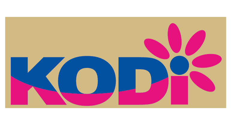
2009 – The five petals above the “i” dot symbolise KODi’s five strengths: Cooking & Baking, Giving & Decorating, Washing & Caring, Writing & Painting and Crafting.
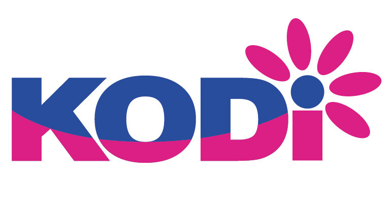
In 2010, KODi erased the surrounding space when displaying the logo. However, the colour and shape of the logo were retained.
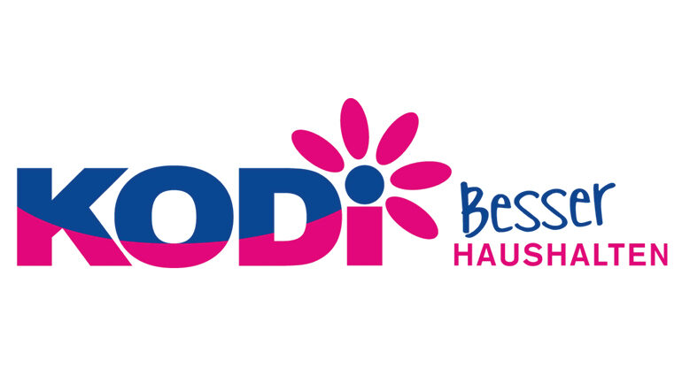
In 2014, KODi adds the slogan “Better housekeeping” to the right of the logo. Again, shape and colour scheme of the logo remain the same.
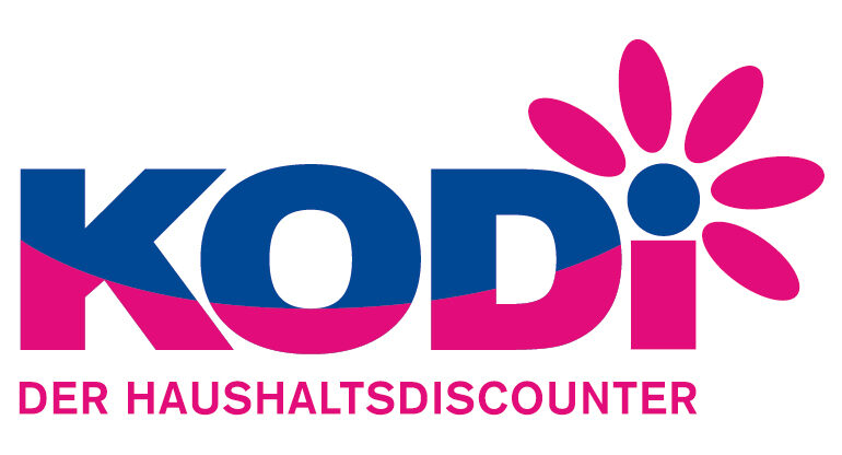
In 2018, the claim was changed from “Besser haushalten” to the current claim “Der Haushaltsdiscounter”.
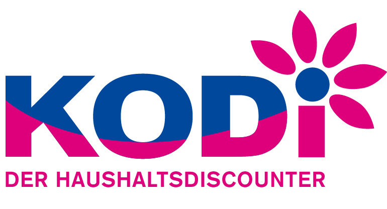
The last adaptation of the logo followed in 2019. The letters were narrowed, the petals tapered to a point.